Apple Arcade review #107: Takeshi and Hiroshi
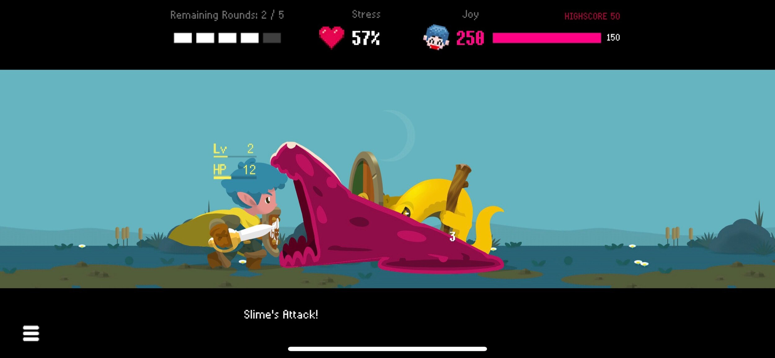
I love the look of Takeshi and Hiroshi. The interactive cut-scenes use what looks like stop-motion claymation or puppets, while the in-game game features clean and attractive 2D art. The story is also pretty great, and well written. The relationship between the two brothers feels real. Even the hand drawn menu art is wonderful.
I am, unfortunately, not as enamoured with the game mechanics. It could be that it takes a while to get into — more than the half hour I allot myself for most of these reviews — or simply that I’m not a big fan of tactical 2D combat or stats management.
You play the older brother and digital dungeon master. You decide on which monsters your little brother will encounter as he plays your in-development tablet game (cheekily, the tablet and laptop look a lot like Apple devices). You have to keep him entertained and engaged, represented in the UI by “stress” and “joy” bars. The challenge lies in picking the right enemies in the right order, keeping the tension up without killing him. Turns out, this is very, very hard! Who knew that balancing a video game was a real skill.
It’s a wonderful premise, executed well — but I didn’t enjoy playing the gamey bits, even though I’m sure a lot of people will. Me, I just wanted more of the story and the sibling relationship, and less of the dungeon-mastering.
Link: https://apps.apple.com/no/app/takeshi-and-hiroshi/id1471596310
